Hero Demonstration
A cinematic overview of the complete visualization system, showcasing depth perception, camera navigation, and the dynamic "pulse" of New York City's urban systems.
A real-time 3D visualization platform that transforms New York City's complex urban data into an explorable, spatial experience—revealing patterns in transportation, density, and infrastructure that traditional charts and maps cannot capture.
A cinematic overview of the complete visualization system, showcasing depth perception, camera navigation, and the dynamic "pulse" of New York City's urban systems.
Top-down view optimized for analyzing congestion patterns, geographic clustering, and transit corridor intensity across the city.
Demand-driven taxi flow patterns visualized alongside fixed subway infrastructure, revealing the relationship between flexible and permanent transit systems.
New York City generates massive amounts of urban data daily—subway ridership, taxi movements, building permits, demographic shifts—but this data typically exists in isolated datasets that are difficult to understand holistically.
Traditional 2D maps and data tables fail to capture the complexity and interconnectedness of urban systems. They flatten spatial relationships, hide temporal patterns, and make it nearly impossible to understand how different city systems interact with each other.
How might we visualize NYC's urban systems in a way that reveals patterns invisible in traditional formats? The goal was to create a visualization platform that could transform abstract data into spatial understanding while maintaining high performance and intuitive usability.
How can 3D visualization make urban data more accessible and reveal insights that 2D representations miss?
Urban planners, data analysts, researchers, journalists, and curious citizens interested in understanding city dynamics.
I conducted extensive research into NYC's open data ecosystem to identify the most valuable and reliable data sources:
Early prototyping revealed several critical technical challenges that shaped the architecture:
I developed a layered approach to data visualization that allows users to progressively explore complexity without overwhelming them:
3D building geometry establishing NYC's physical form and spatial context. Includes accurate building heights and footprints for all five boroughs.
Color-coded visualizations mapping demographic, transit, or economic data onto the geographic base. Users can toggle between different data themes.
Time-based visualizations showing movement patterns, daily cycles, and long-term evolution. Includes playback controls and time scrubbing.
Drill-down capabilities for exploring specific neighborhoods, transit routes, or data points with contextual information panels.
Navigation in 3D space requires careful consideration to balance exploratory freedom with guided discovery. I designed a multi-modal control system:
Initial 2D studies to establish visual hierarchy, color theory, and data density principles before translating to 3D space.
2D animation prototypes testing information rhythm, annotation timing, and what elements remain legible during camera movement.
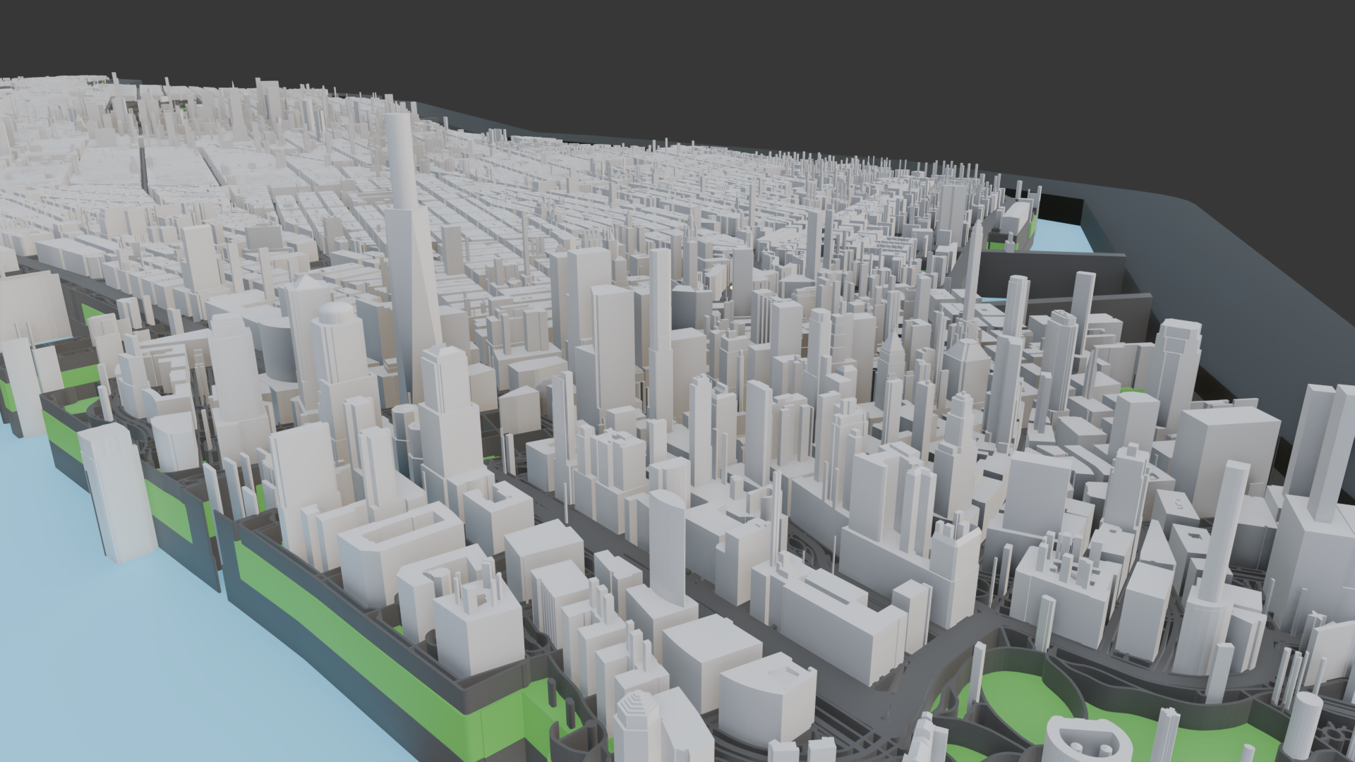
Complete NYC building model serving as the spatial foundation for all data overlays. Optimized geometry with level-of-detail system for performance.
Comprehensive visualization of all subway lines operating simultaneously, revealing system-wide congestion patterns, bottlenecks, and network behavior throughout the day.
Real taxi trip data showing demand-driven "desire lines" across the city, highlighting activity hotspots and temporal demand surges in contrast to fixed subway infrastructure.
The transportation layer visualizations reveal several important urban patterns:
The platform is built with modern web technologies, carefully selected for performance, maintainability, and cross-platform compatibility:
Core 3D rendering engine with custom GLSL shaders for efficient data visualization. Handles geometry generation, lighting, and camera systems.
UI framework managing application state, user controls, and data layer toggles. Integrates with Three.js using React Three Fiber.
Data processing, scale generation, and color mapping. Handles CSV parsing, data transformation, and statistical calculations.
Off-main-thread processing for heavy data operations, geometry generation, and calculations to maintain 60fps UI responsiveness.
Rendering millions of data points in real-time required sophisticated optimization techniques:
The system processes and transforms raw city data through a multi-stage pipeline:
Less is More in Data Visualization: Early versions attempted to visualize too many data dimensions simultaneously, resulting in visual noise and cognitive overload. Through iteration, I learned the critical importance of progressive disclosure—showing users one clear layer at a time while making deeper exploration optional and intuitive.
Performance as a Feature: Smooth 60fps performance isn't just technical polish—it's essential to the user experience. Any frame rate drops break immersion and make the visualization feel sluggish. Extensive optimization work (LOD, culling, instancing) proved as important as the visual design itself.
3D Navigation is Hard: Users unfamiliar with 3D environments need careful onboarding. Adding landmark-based "teleport" navigation and gentle constraints (preventing camera from going underground) significantly improved usability testing results.
Context is Everything: Raw data visualization without context is just pretty colors. Adding contextual information (neighborhood names, transit line labels, statistical comparisons) transformed the tool from an interesting demo into something truly useful for understanding the city.