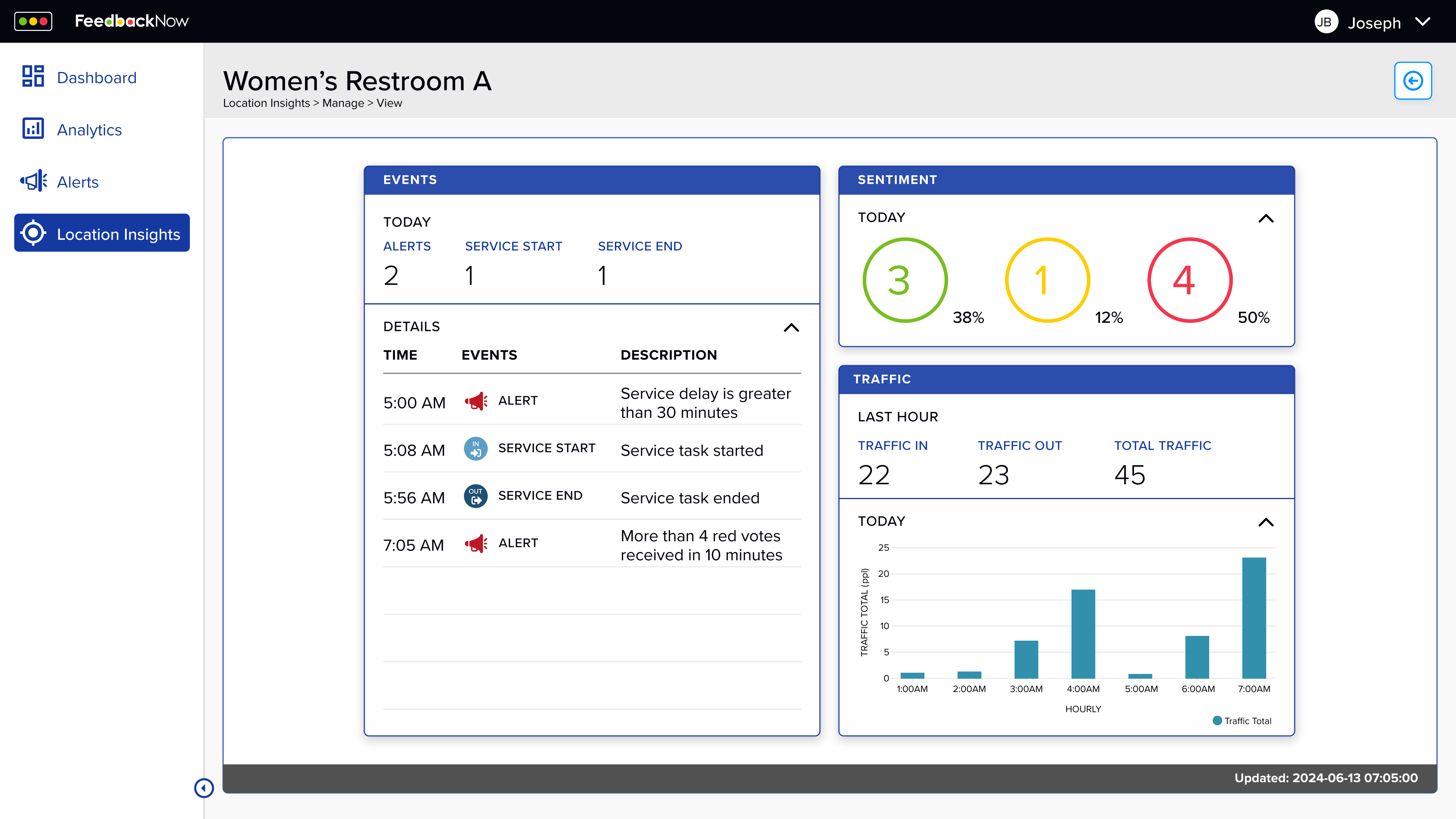
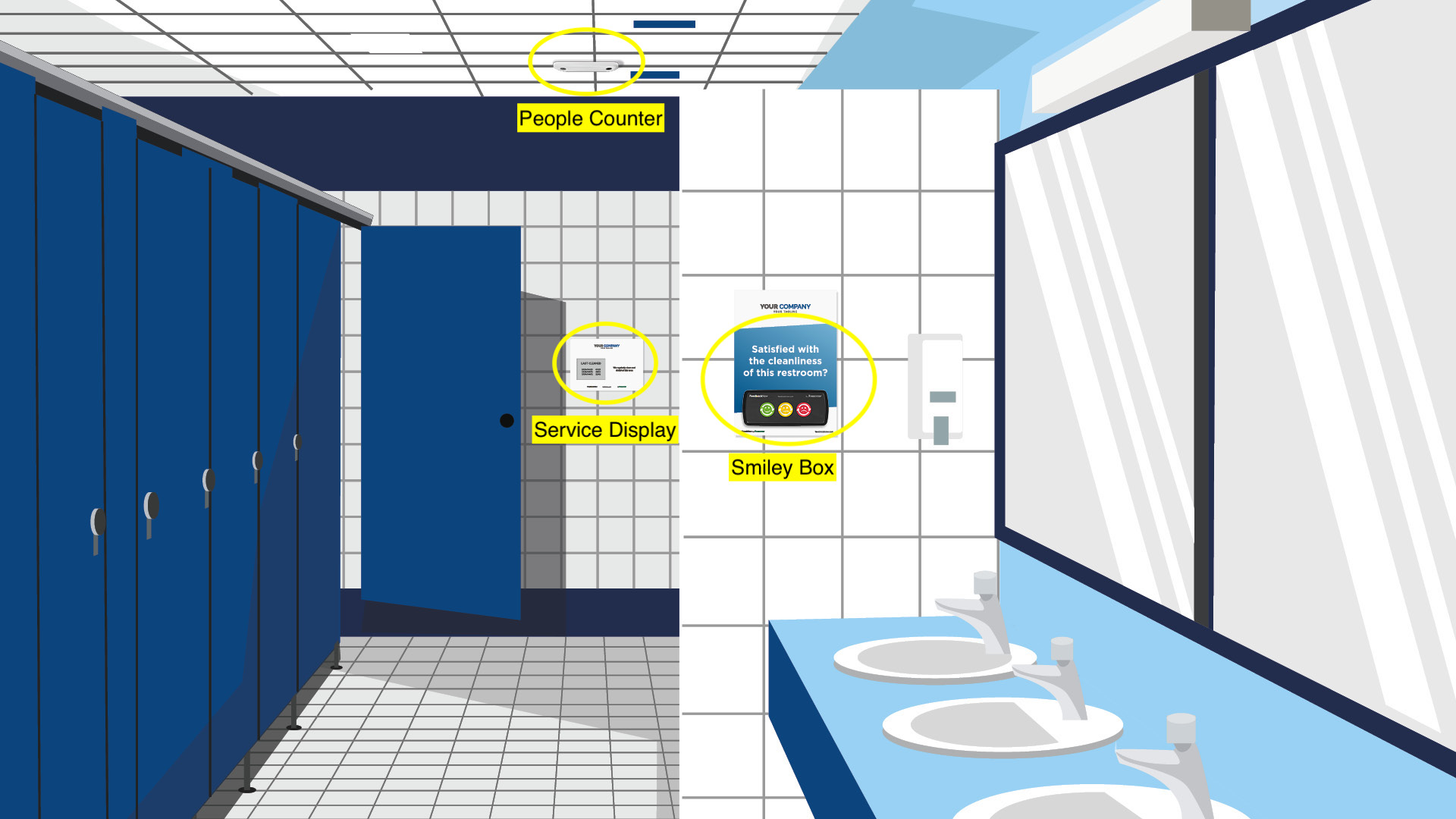
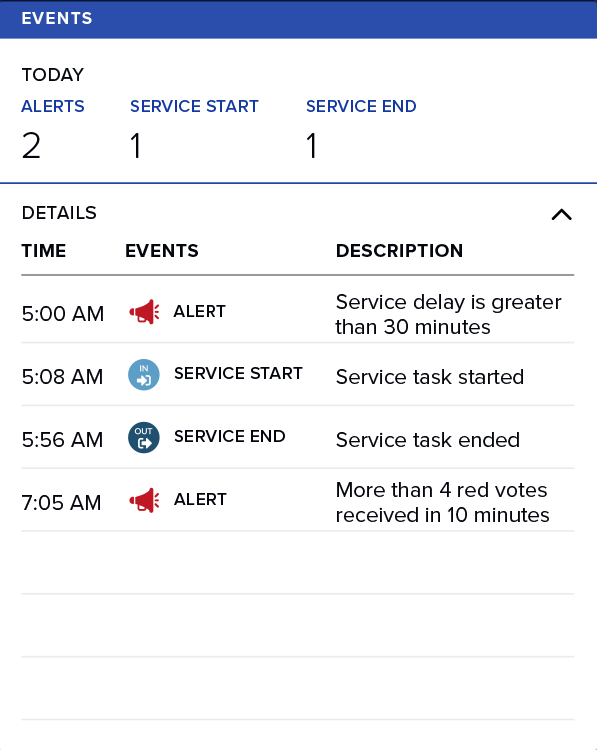
Where signals begin
Customer experience issues start in physical spaces. I defined “signal hotspots” (lobby, conference rooms, restrooms) to ground the story in the real world and give demos a clear starting point.
Designing dashboards that tell compelling stories
A B2B dashboard redesigned to help sales teams tell persuasive stories during client demos.
FeedbackNow's B2B dashboard was cluttered, lacked hierarchy, and made it difficult for potential clients to quickly grasp how user feedback translated into actionable insights.
During my internship, I worked closely with CEO Steven Peltzman and designer Amisha Jaggi to redesign the dashboard not just for end users, but for the sales context where its story needed to be told.
I sat in on sales demos and watched the struggle. Sales teams would jump between sections, trying to explain metrics while clients looked confused. The interface fought against the story they were trying to tell.
Charts competed for attention. Key insights were buried. Navigation assumed familiarity the prospects didn't have yet.
"I lose them in the first 5 minutes"
Sales rep describing typical demo experience
"Where do I even start?"
Common client reaction to dashboard density
"Can you show me what matters?"
What prospects actually wanted to see
I needed to understand not just what the dashboard showed, but how it needed to convince.
Research Phase
Instead of treating the dashboard like a reporting tool, I mapped the narrative sales teams needed to tell during demos: physical signals → platform insight → real-time response.
Customer experience issues start in physical spaces. I defined “signal hotspots” (lobby, conference rooms, restrooms) to ground the story in the real world and give demos a clear starting point.
Frictionless sensors capture sentiment, time, and location so teams can quickly answer: what happened, where, and when.
Captured signals roll up into readable metrics that support a demo narrative. The goal wasn’t “more charts”, it was clear evidence that connects feedback to decisions.
Alerts trigger when thresholds are crossed, turning the dashboard into an operations tool—not just a report. This “moment of action” became a key beat for sales demos and later shaped the guided walkthrough mode.
This narrative framing became the foundation for the redesigned hierarchy and the guided walkthrough mode.
Physical signals are intentionally structured so they can be surfaced in dashboards and escalated as alerts without requiring interpretation during a live demo.
The redesign centered on one principle: lead with what matters during a live demo. I prioritized alerts and critical events at the top of the experience, then organized the rest as supporting context.
This card is a hierarchy test: summary first (Today’s counts), then details (timeline), with visual emphasis on urgency so sales reps can narrate without hunting.
Real-time alert escalation delivered directly to teams when thresholds are crossed.
Sentiment distribution designed for instant readability during live demos.
Hourly traffic patterns reveal usage spikes and service gaps over time.
Physical environments where feedback signals originate, grounding the system in real space.
"Now I can walk through a demo without losing the narrative. The design does half the selling for me."
— Sales team member after using redesigned dashboard
Rather than creating a rigid presentation mode, I designed the dashboard to support a guided walkthrough that sales teams could control in real time.
Alerts anchor the story, summaries establish context, and deeper metrics remain available without interrupting the narrative. Sales reps can move linearly when needed, or pivot based on client questions.
This approach transformed the dashboard from a tool you navigate into a story you tell.
The redesigned dashboard gave sales teams a clear, compelling way to demonstrate value. Stakeholder feedback confirmed the design made pitches more persuasive and client-focused.
This project fundamentally changed how I think about context in design. I learned that great B2B products aren't just designed for end users. They're designed for the moments when someone needs to convince others of their value.
Working with Steven and Amisha taught me the importance of designing for the narrative, not just the interface. The dashboard needed to be both a tool and a story. That tension between flexibility and guidance, between exploration and persuasion is where the most interesting design problems live.
Most importantly, I learned that design directly influences business outcomes. By understanding sales team needs, I could create something that didn't just look better, it performed better where it mattered most.
This internship showed me how thoughtful design can shape compelling narratives, make complex information feel simple, and directly influence business outcomes.
It reinforced my belief that great design is as much about storytelling as it is about usability—especially in B2B contexts where the product needs to sell itself before anyone can use it.